top of page


Naming
Branding
Website
Motion
Illustration
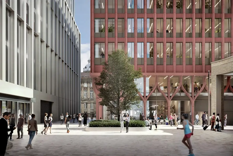
The Drapery is a newly redeveloped office space designed to foster collaboration and human connection in the heart of Birmingham. The brief was to create a brand identity that feels personal, warm and contemporary, positioning the building as a fresh alternative in a market largely dominated by corporate, conventional offerings.


We developed a dynamic identity that reflects the building’s focus on people and modern ways of working.
At its core is a logotype that shifts in motion between script and serif styles, capturing a sense of flexibility, individuality and movement. The logo becomes a visual representation of how the space adapts to different working styles and needs.
The colour palette features soft, pastel tones that feel inviting and open, avoiding the cold neutrality often found in commercial office branding. Generous white space throughout the design allows photography to take centre stage, showcasing the light-filled interiors, open layouts and collaborative amenities.
The result is a calm yet distinctive brand that feels modern, approachable and relevant to a new generation of companies looking for more than just workspace.


bottom of page